Get in touch
User experience (UX) for industrial software: For a long time, this wasn’t something to which people gave much thought, but now it’s becoming ever more important as applications become more complex and digitalization increases. Usability and design are no longer only relevant in the Business-to-Consumer and Business-to-Business sectors. At AOE, we have been working from the beginning with an eye to technology and UX, and therefore we understand how important it is to match systems to the needs and environment of their users – even in an industrial context.
In a classic online shop, the shop itself and the product have to persuade consumers, motivate them to make a purchase. Frequently the first few seconds are critical here. If this does not happen or if the application results in errors, customers leave, and in the worst case, they never return. Nobody wants to have to learn how an online shop works. With business and industrial applications, by contrast, users often have no choice about the system they are using, so they must learn how to operate the system they have got.

Software applications in the industrial context are frequently complex, they offer a wide variety of functions, and they have to capture and process a large quantity of data. Often there are various interfaces to distributed systems, which have to communicate with one another on different devices with different interfaces. The life cycle of industrial software is usually much longer than an app available in the app stores.
If the operation of such an application is also complex, users have to be trained, which can represent a significant investment in the employees for the employer. This is the first advantage of a good user experience: An intuitive user interface reduces the need for and costs of training. In addition, untrained employees can jump in and help out more easily, which makes planning work more flexible.
But well-trained employees also work more efficiently if the application is consistently oriented toward their needs and requirements. A user interface that always puts precisely the function required in the foreground and can provide clear instructions for action makes work much easier and minimizes errors. Individual right and role concepts can provide support on the system side here, by granting access to content and functions only to particular user groups and thus enabling focused work.
For the design, in addition to the specific conditions of the work environment, it makes a big difference whether the application is a product for performing entirely new tasks or a tool that should optimize existing and familiar workflows.

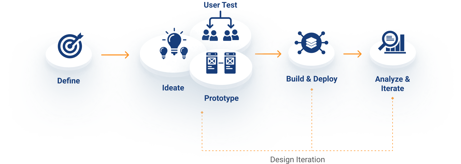
With new products, designers must get to know the tasks and goals in order to be able to develop scenarios for the user experience in cooperation with all project participants. Design thinking and iterative design-sprint methods can help find approaches for the development.
To optimize existing ways of working, a dedicated design phase before the project starts can be helpful. This is most effective in close cooperation with specialists and users in participatory design processes. Here, research refers to the existing situation, the identification of pain points, and needs that are not fulfilled, because users in industrial projects often have very specific requirements and the environment requires that special measures be taken.
Clickable prototypes simulate and visualize workflows in advance, usability tests should be done in delivered increments, but if possible conducted on-site – under realistic conditions. For if the lighting in the warehouse is poor, screens cannot be positioned optimally, or if employees have to wear gloves while they are working, requirements arise that cannot be reconstructed in an office situation.
Our current project relies on 4 design principles that help make decisions and discussions of these decisions easier during the design process:

Most people don’t read instruction manuals. If an application is supposed to work without them, all the options have to be easy to find. The more selection possibilities users have, however, the more decisions they must make. This slows work down a lot. In order to be able to perform tasks one after another in focused fashion, context-dependent options are highlighted, which means that what is hidden can be found more easily when necessary.

Suggestions for sensible follow-up options relieve users of work and get them to their defined goal more quickly. But user inputs also require time and effort. Proposed, thoughtful options and sensible default settings can help keep the number of user inputs as small as possible. A functional design approach also guarantees quicker reactions by the user interface, so that users and not kept waiting by long load times.

We orient ourselves according to standards and use familiar and proven elements so that users know what they must do next without having to learn their way into new models and tools. This is especially true for interactive elements, navigation mechanisms, and organizational structures. The principle is that if something looks the same, it should also behave the same. This way, the design becomes stable, reliable, and foreseeable – important properties for efficient work with a digital interface.

A clear, minimalist design, naturally in harmony with the corporate identity, should have no unnecessary design elements. In this context, form follows function means that the appearance closely follows the behavior. Emotions have no place here; easy recognition, by contrast, is always foremost. Sufficient contrast is important if the application should issue a warning, for example, or if the work environment features difficult lighting conditions. When an application is used for a long time, it is important to make sure that users’ eyes don’t get tired out by too many contrasts.
Intuitive operation can be a decisive advantage over competing products. User-friendly interfaces can reduce application errors and increase productivity. This way, usability becomes a success factor for industrial products.