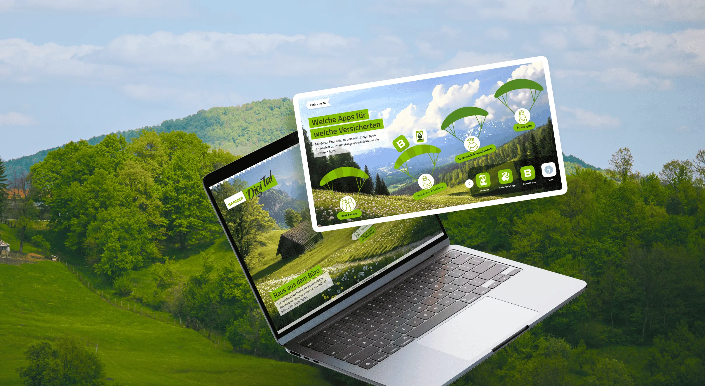
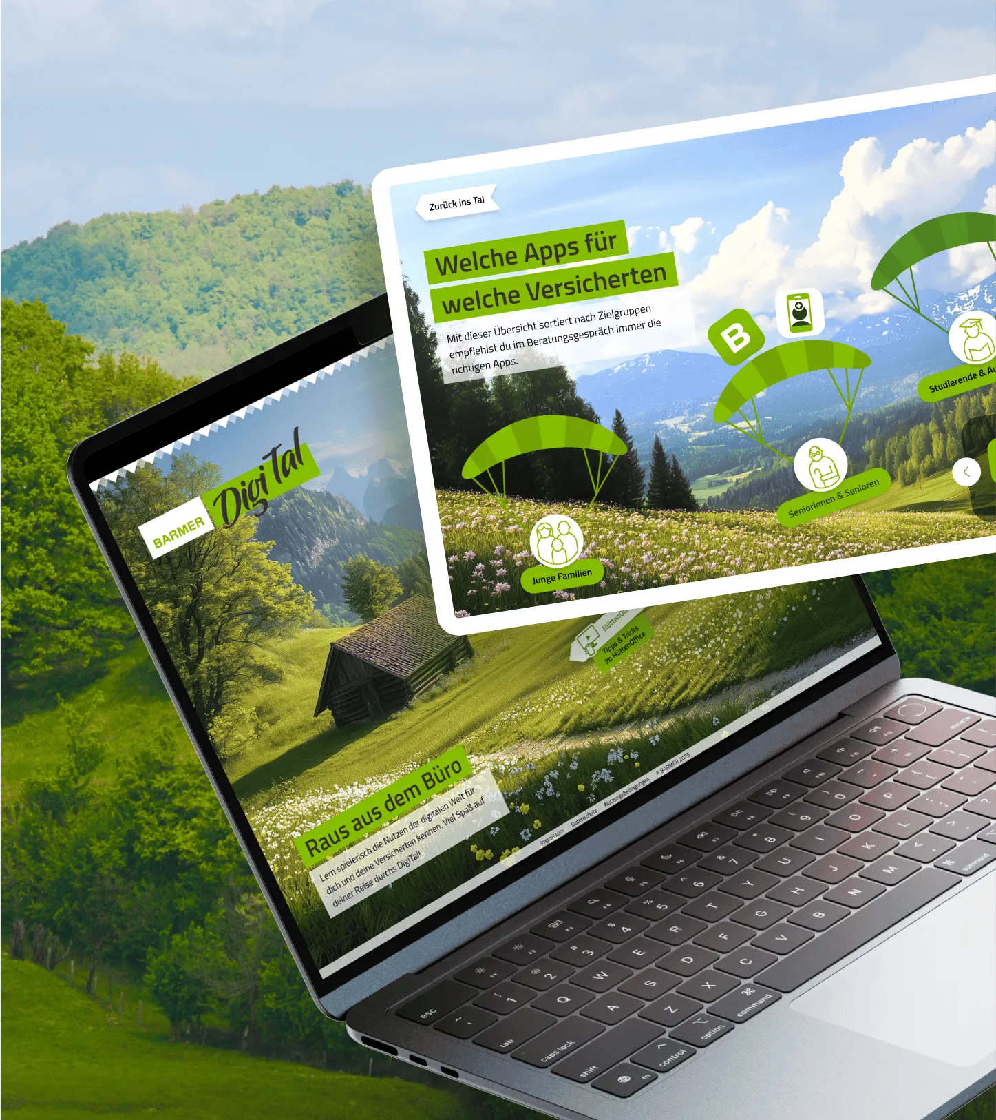
Building an accessible and responsive learning platform


The BARMER DigiTal tool was created to support the company’s goal of improving the digital competency and literacy of its employees in a fun and easy way. It is unlike any other BARMER learning platform and transfers knowledge in a way that doesn’t feel like work. ENNOstudio supported BARMER, both before and after the launch, and in doing so took the tested concept to the next level. We also drove the tool’s technical implementation and the overall creative communication campaign.
Challenge:
Developing an accessible, gamified learning platform for employees
Outcome:
Increased user adoption & engagement through gamification & co-creation
Outcomes
Learnings
Design and implementation on the same page equals speed
The close cooperation between design and development was crucial to this project. It increased the speed of implementation and supported quick and feasible solutions, especially for those parts of the project related to accessibility. This project showed that corporate entities are actually able to adopt a lighter and friendlier tone and that BARMER was much more open-minded to disruptive ideas in terms of design and communication than we expected.
Intro
Challenge
Building an accessible and responsive learning platform
Our course of action involved the main task of improving on an existing tool in terms of its design, its accessibility (AAA) and its technical development. To ensure that the DigiTal is more accessible than the previous incarnation, we used more appropriate font sizes and correct colour contrasts, made improvements to the layout for better readability and enhanced the screenreader compatibility. Furthermore, we created a responsive design to align with the goal of making the platform available to all devices. In addition, we included a co-creation option to make the tool more attractive and to let employees feel included in the digital learning journey.
Solution
Gamification at the heart of DigiTal
The core concept of DigiTal is a gamification approach that is accessible to all employees. We worked closely with the target group and stakeholders throughout the whole process to ensure that we were creating a tool that employees would like and enjoy using. We had regular rounds of testing and feedback, so as to improve on a continuous basis and create workable features and content. It was important to get the knowledge transfer right, and to make this happen we employed elements like illustrations and infographics, for example, to underpin engaging reading experiences.


A standout creative internal launch campaign
It was then on to the internal launch campaign for the platform we created in conjunction with BARMER. We followed a strategy that had a different tone and feel to normal BARMER internal communications, which involved focusing on a more humorous and proactive engagement. The creative concept was related to the landscape and environment the DigiTal is set in, and took the playful design of visuals, videos, newsletters, stickers and Gifs for the various different internal channels to the next level.
Quotes
Business benefits
Management Summary
We'd love to hear from you
Our experts take a deep dive into your case to understand your requirements, assess your infrastructure alongside your IT team, and develop tailored solutions. With our knowledge and expertise, we enhance your team’s skill set - driving speed and efficiency. Ready to take it to the next level?


